|
||
|
Jess you've developed so much as an artist and really carved out a niche for yourself as an indie font maker. Jess: I've done okay I guess. It's only taken me ten years! I read somewhere that it takes seven years to become a good type designer and I agree with that. I wish I could erase some of the type disasters I've unleashed on the world. Don't ask which ones, hee. J.A: You did a first-rate job on Shimmer. Its casual, swank and expressive without being overwrought—an ideal combination of features for the buoyant handwritten script font market. Did you aim at these qualities directly or was it more a spontaneous thing?
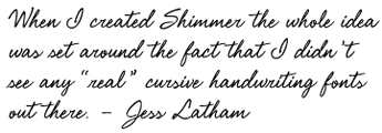
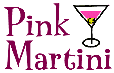
Jess: When I created Shimmer the whole idea was set around the fact that I didn't see any “real” cursive handwriting fonts out there. This is probably why it's had such a positive response. I have to say I actually thought this would be a best seller and I was really excited while I was working on it. I was hopping around saying “It's working!” That's usually not typical of how I feel. Most of the time I'm very unsure and I'm saying “Eeeee, I don't know...” For instance Pink Martini was finished and I was very close to just scrapping it and never letting it see the light of day. Of course, it became a best seller and later became a best seller again with version 2.0. I'm a very harsh critic of myself and sometimes I have to ask around and let other designers look at my work while I'm working on it and see if they think it's something that they could use. J.A: Shimmer's OpenType alternate characters and ligatures go some way towards simulating handwriting. Eye Catching adds more wizardry for a more convincing handwriting effect. Jess: Yes, every time I design a font I'm always thinking about “what if” and Eye Catching was sort of a “what if” version of Shimmer. J.A: Making Shimmer and Eye Catching gave you the opportunity to build up quite an impressive bag of OpenType tricks. Jess: It was a hard nut to crack but I learned so much doing that font. J.A: Where does your interest in 70's retro and funkiness originate? Jess: I think it reminds me of my childhood. Instead of paying attention in class I liked looking at the graphics in the textbook. I would always wonder who did all those illustrations and graphics. I think you can predict what the next generation of kids will like when they grow up just by observing what was going on when they were kids cause I think everyone likes being reminded of their childhood. I was very good at art even when I was in first grade. That was the year that the teacher had to leave to have a baby and the substitute let us do lots of drawing and she gave us all a big sheet of paper and some crayons and just said go to town. The kid in front of me was drawing a football and I was kind of hesitant and didn't know what I wanted to draw so I just did a football too but then I thought, Ewwww I hate football, so I started drawing all these abstract shapes around it to just cover up the fact it was a football and so the teacher was like, Oh! an abstract, and she had the whole class doing abstracts after that and she would have the class stand in a circle and hold up our work and ask the class what we saw in the shapes. J.A: Mmm, childhood is kind of a mystery that fascinates everyone I think. I had a similar experience when I was the first kid in class to do a picture where the sky was an expanse of blue extending from the horizon to the top of the paper, while everyone else was drawing the sky as a narrow strip of blue at the top. Your favourite font is Bauhaus?
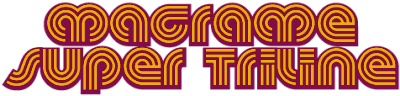
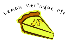
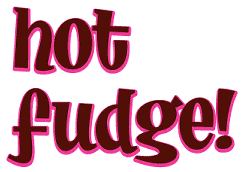
Jess: Yes, Bauhaus is still so modern-looking today so it was way ahead of it's time and I think that's why it's making a come back. It was definitely an inspiration for my Macrame font. J.A: Tell us all about that inspired retro type, Majorette. Jess: It started out as just a logo for my website. What I do remember about Majorette is having a really hard time designing the caps. All the letters were designed upright and it wasn't until I got everything into fontographer that I added the slant. While I worked on the upright version in illustrator I would occasionally stop out and slant them to see how the final font would look. If I designed this font today it would have tons of alternates in the OpenType format cause I had a hard time making up my mind. It's possible I could go back and make an OpenType version. J.A: The capitals turned out great. Hot Fudge is a friendly, happy, playful font. But where did it come from? Jess: Hot Fudge was one of those "hypnosis fonts". That's when I just load up my mp3 player with some music that fits my mood at that time and I open Illustrator and start drawing shapes. I feel like everything goes away around me. The shapes start to turn into letters and then I start to spell words. I like to start making words out of what I'm working on inside illustrator and finding out how the letters are going to fit together. This is important so all the combinations of letters to look natural together. J.A: Can you describe the mood you felt at the time? Jess: I was probably flying high on fudge. My brother makes this fudge that's so good that we call it crack fudge cause you become addicted to it. J.A: Meringue is very pleasing for its lack of pretence. Too many faces in the naïve hand-drawn category look contrived and self-conscious, but Meringue is subtle in its whimsy without a trace of self-interest. Jess: Meringue kind of came to me in a flash and I saw it completely finished in my head. It was done really quickly with a pointed pen nib dipped in ink. It's not that popular for some reason but it's one of my favourites. J.A: Mine too, and I mean not just out of your catalog but all fonts in its category. Meringue is exactly what I expect to see used for eating establishments and anything food-related. Impressive as your fonts are there's more to you than meets the eye, a whole other dimension most people aren't aware of—you can make your own pants.
Jess: I've been sewing commercially since I was 18. I've actually sewn very little "fashion" stuff. It's mostly been things like lab coats, seat cushions, hospital pillow cases, etc. It's not until recently that I started to design my own clothes and I don't know where it's going or if it will ever see the light of day but I have fun doing it. Sewing is my favourite thing in the world. J.A: Excellent. And the person you would most like to meet is fashion designer Betsy Johnson? Jess: It's not so much the clothes she makes rather she doesn't just make the clothes she also wears her own stuff. She's bold and loud and I guess I wished I was more like that so I really admire her for that. J.A: Your Snacky Zine interviews with artists Fawn Gehweiler, Todd Oldham, and Howard Cruse show your interest in other artists, what makes them tick and the circumstances that lead them to create in particular ways. Will we see more instalments of Snacky Zine?
Jess: Snacky Zine is something I want to keep adding to but the right person has to peak my interest. I have an interview with Maggie Estep that my twin brother did a while ago and I might put that up. I'm surprised you didn't ask me what the word snacky means. It's actually a family word that my sister Paige made up when she was little. We use it when we're trying to describe something that is, fun, cute, whimsical, colorful. The Japanese have a word that's similar, “kawaii”. You can't use the word for just anything that's cute. For instance if you were going to describe something or someone as snacky. It couldn't just be anything or anyone that was just cute, they would have to have a certain quality, something that made them unique, elfin. Connor Oberst, the lead singer of Bright Eyes, for example is very snacky. If someone knitted you a scarf and it looked really handmade and it had some skipped stitches, that would be majorly snacky!. J.A: Right, then quite a few of your fonts can be described as majorly snacky. And vinylly, what have you been working on lately? Jess: The past few years I've been really busy learning to code things. First, I really got into coding my OpenType fonts. For my latest handwriting font Eye Catching I programmed starts and endings. It seems like the learning curve to make a working font is getting steeper and it takes time to catch up to the technology. That's why my output has slowed down. After that I spent the rest of that year learning to code my website into PHP and setting up a database. It's so easy to update my website now and it's so weird to have just five PHP files that creates all the pages on my site. J.A: I am seriously impressed. Jess—thanks so much for sharing it's been real. Jess: Thanks : ) |
|
|
“The Vinyl Curtain: a conversation with Jess Latham and James Arboghast” is copyrighted intellectual property of Jess Latham and James Arboghast (c) 2007, all rights reserved worldwide. The moral right of the authors has been asserted. No part of this document or its contents may be reproduced in any form without prior written permission from the authors, trade enquiries welcome.... |