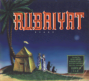
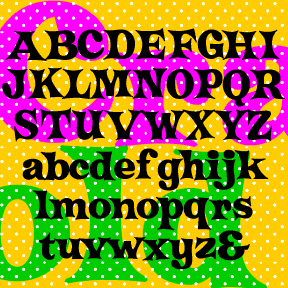
J.A: Thinking about Harold Lohner’s fonts evokes images of cinema, quaint chinese food cartons, American cheese, blackletters, bizarre hybrid types, mysterious ouija boards, the types of Rudolf Koch, and many other eclectic font creations. A large percentage of them involve humour, making use of unusual or non-mainstream letterforms and offbeat letter structures. Mystic Prophet, Sanitary, Chinese Gothic, Esquival, Cabaletta, Carmen Caps, Harlequin, Koch Rivoli, Onion, Queer Theory, Radio, Rubaiyat Engraved, Trudeau, Gaumont, Graceful Ghost, Font Shui. Those are just a few examples. Even the relatively plain Goya Heavy contains a few non-standard letterforms for a set of linear capitals.
Harold, what is the deal with your fondness for unusual and offbeat letterforms?
H.L: I’ve got more going on in my head than I can work out in one medium or one style. My old art professors’ contradictory voices still ring in my ears, telling me to make a consistent body of art work but still keep pushing in new directions. I feel less restricted in making fonts. They don’t come from my soul. They’re not as deep or poetic as I’d like to think my art work is, but they do scratch a creative itch.
That they are popular is strangely gratifying. I get so much more validation from these silly things I make to kill time and stave off boredom than I ever have from my “real” art.
The urge to make fonts comes from a different part of my psyche than, say, my monoprints. Humor is a big part of my personality, but is largely lacking in my current serious “gallery” work. Part of my tendency to make display and novelty fonts is like making myself laugh—Ringpin and Safety Pin come to mind. I also enjoy the puzzle aspect of it. With Radio, Trudeau, Esquivel and others that were inspired by logos or bits of text, the puzzle principle comes into play. If N, P & R look like this, what would O, M and the rest of the characters look like? Queer Theory, Chinese Gothic and others come from a desire to create hybrids. Crossing Courier with an uncial, or a pseudo-Chinese font with an ‘Old English’. Alsace-Lorraine, Kombine and others would fall into that category.
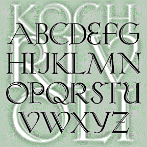
I also like the idea of expanding or translating something pre-existing. The Ouija fonts, Cabaletta (now called Roosevelt), Koch Rivoli and other such ‘revivals’ come from a desire to bring something of the past forward into the digital age. In making them I am praising and preserving the original design.
I have a great appreciation for classic typefaces and favor those when doing graphic design. Designing a beautiful new text font would be of no interest to me at this time. There’s enough already, made by far better designers than me.
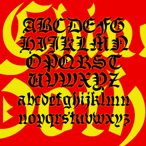
J.A: Mystic Prophet—the forms are quite strange but they follow a plan of sorts. The whole thing is astonishing in effect, bizarre and electric. This one came from the planchette of an Egyptian-themed talking board (the proper name for these things). Mystic Prophet is my favourite of all your fonts. Structure is the biggest thing for me as a type designer, making this the clear winner in your catalog because it’s so structured and stylized. Weird gothic-meets-roman capitals with an eastern geometric bent.
H.L: It always makes me happy that someone connects with one or another of my fonts. when i’m making them, they’re each my favorite child. but then another baby comes along and i start not to recognize or even remember the names of the ones who don’t demand my attention. Since making that font, I have seen other examples of similar lettering, so the style is out there. If you’ve never wasted a couple hours at this site, check it out. screen captures of the title card from 100s of movies. i believe i saw some like this in there. Designers so often us use the classic fonts Legende or Ondine for an ‘Arabian’ feel, this seems like another choice. Is there a list of go to choices? Neuland for a primitive, monster or African feel, American Uncial for a Celtic touch... I love and hate clichés.
J.A: Some time ago in our correspondence you mentioned “willful ignorance” as a self-imposed condition for you. That’s part of what I call “the art of living”. Mountains of information on typography and thousands of types exist which I purposely ignore to ensure my own creative freedom. I figure it doesn’t really matter if I create fonts that are close to ones that already exist—it’s all been done before so I’m better off ignoring specific designs and making my own personal explorations. Plus the joy of invention is half the fun.
H.L: i’d rather let what i do be more spontaneous and expressive than calculated. more like a jazz riff than a chess move. i take in a lot of information, but then i just give up and do my own thing. it can be intimidating to know everything that’s going on, what’s been done already. in my art work, i prefer to do the research afterwards, more to see the context into which what i made fits. i’ve known artists who were up on all the latest things and then tried to position themselves between what has and hasn’t been done.
when i make a “revival” i do try to find out if it’s been done already. if i find a digital version and it’s good enough, i’ll do something else. a couple times i’ve discovered a good digital version after i made mine and i feel like i’ve been retracing paths. if i know about another version ahead of time, i can consciously try to make mine better or at least different.
J.A: “...more like a jazz riff” —can you expand on that?
H.L: i’m not a big music fan, period. there have been times in my life when i bought and listened to a lot of music, but of late i choose silence over music and feel there is too much sound around us altogether. two technologies i am intentionally avoiding are iPods and the hands-free cell phone that you wear on your head. shut up, tune out, and listen to the music in your own head, man :-)
but i appreciate music. i like that musicians ‘play’ music. artists say they’re ’working’ on their art ‘work’ but musicians play, and play with others, as do actors. when i get inspiration from someone else’s suggestion (a letter, a logo, a phrase), and then come back with a creative response—that’s what i meant by “more like a jazz riff”.
in printmaking there can be a lot of accident and chance that go into the work. you can learn to control it and you can learn to make use of it. the way the materials react is something one can play with too.
to me jazz is abstract art. i don’t make abstract art, but i am very interested in and conscious of the abstract elements of the pictures i make, composition, shape, color, line, pattern, gesture, etcetera. fonts are much more abstract. what can constitute ‘A’ or what ‘A’ would be like in a particular key or on a particular instrument—that’s a font riff.
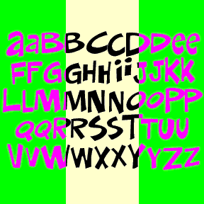
J.A: There’s a pronounced sense of whimsy and wackiness that kind of defines you as an artist. Kaffeehaus Neon and Bloop script attempt kitsch. You’ve also ventured quite successfully into pastiche with Don semiformal. A classic informal letter with the Harold Lohner twist—done the way only you would do it. This is pastiche!
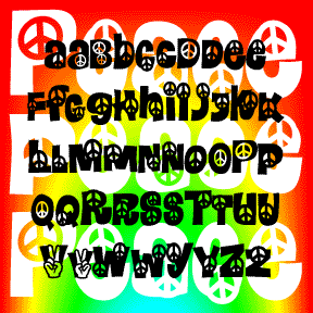
H.L: yes, pastiche is the right word. i like to make font jokes for my own amusement. don semiformal, smelvetica and my daisyland spoofs peace, calaveras. sad in a way too—what an insular, nerdish thing to do. from my webpage, at the bottom of the list of styles on the left are some links headed “can fonts be funny?”--all those things made me laugh. like this one
i’m serious about everything i do, but not always solemn.
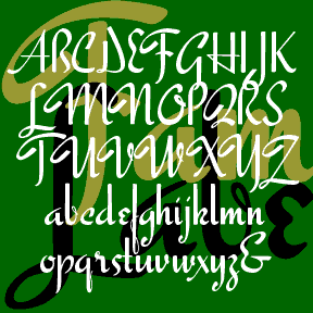
J.A: To make artful script letters the type designer’s task is akin to that of an actor. Easter Parade, Famous Label and Roselyn have the ‘high style’ and contrast of traditional scripts, while New England and Scarlet Ribbons are understated. Those two contrasting approaches to script types can be likened to the stylized performance of early film acting versus the naturalistic acting style of post-war and international era cinema.
H.L: i prefer stylized to whatever the opposite of that is. ‘natural’? art is not natural, it is artificial. even ‘realism’ refers to a style. i do love old films and actors, old magazines and thrift stores. i’m also fond of new things and contemporary culture, but it doesn’t inspire me the way things of the past can. not sure what my favorite style of acting would be, but i do love a mannered performance. bette davis, for example. the lie that tells the truth. and of course i love kitsch, but i can’t make real kitsch any more than i can make real folk art. delightful to find, treasure, mock, parody.
it’s interesting for me to try to get inside the head of an artist or designer from another time, working with different materials. so there is an aspect of taking on someone else’s character (no pun intended). a period film of the past often says much more about the year it was made than the year it was set in. the acting style, the politics, production design...even ‘real’ is fake in movies.
J.A: The same is true of type design. Real is fake down to the tiniest details. There’s a mutual interest and payoff for you between being a film buff, being a lettering artist, and being attracted to wacky and whimsical letters. You’ve brought some fabulous title lettering from older films into the present with Gaumont, Gainsborough, Silver Liner, Director’s Script, Imitation, Auteur, Libeled Lady, Bride of the Monster, Oklahoma, The Byrds, Screwball and several others. Most of the source films for these are 1940’s, 1950’s at the latest. You’re really indulging yourself here by combining three passions at once. That must be so satisfying, in the sense that this is what being an artist is really all about. (What I mean: I think this is good, really a good thing, the only way to go)
H.L: Making art for me is very self-indulgent and that’s what I love about it. Luckily, I’ve been employed as an art professor for 26 years. I’ve never had to make a living from my art which is very good because what I like to make most and make best is usually not of wide general interest or appeal. I have done graphic design for hire; i had a client once tell me to design something that was “not too clever”. I can do it, but it’s not what i do best.
I love good movies of all time periods. Since i don’t write essays, make films or tell stories, it’s hard to tell what to do with all the inspiration a good film contains. Nowadays, the film credits almost always use font typography, instead of hand lettering. I would absolutely love to design a matching font for the DVD release of a classic film, a font that would really match the feel of the original. that’s one of my secret career goals.
J.A: I’ll see what I can do to make that happen. I can’t promise anything but touch wood. Now that your fonts are available at Font Bros you’re getting much more exposure and it puts you into the wider context of fellow artists like Ronna Penner, Jess Latham, Ben Balvanz, Brian J. Bonislawsky and others, all of them very talented but mostly younger than you.
H.L: i’m very grateful to font bros for holding my hand and leading me to greater success with my fonts. i had wanted to get them out to a wider audience but i’m a bit lazy, would rather make fonts and art than try to promote them.
J.A: Your monoprints are your “solemn” art. Contemplative and emotional in impact, many of them are melancholic or dark, but your sense of whimsy shines thru here and there; some of them are quite brightly colored. The male human body and male physique are recurring themes, and there’s a strong sense of the human condition—a solitary sense of being and quiet reflection. These prints seem to validate your inner psyche and deepest feelings.
H.L: sometimes i think of my ‘real’ art as my poetry. I have done things in the past (sculptures, it’s hard for me to believe now) that were very lighthearted and even comical. But I’ve always had a dark, moody streak and I think that’s what comes out in the prints now. On a personal level, I may be happier than I’ve ever been. So the prints are a way of exorcising some of that stuff.
The prints are also about people, about sex, etcetera, which would be hard to make a good font about. Subject matter is important to me; typography and alphabetic forms are very abstract.
There is a very satisfying physical aspect of printmaking that i also enjoy. I like flowers and green grass, but i hate to do my gardening. But i love the smell (even stink) of ink and the processes of drawing big and squeezing it through a press. Many printmakers I know have a similar earthy connection to the process. I’ve always been too shaky and spontaneous to do sustained lettering by hand, so the computer lets me do that. But I do like to push myself away from the keyboard and mouse and get dirty working directly.
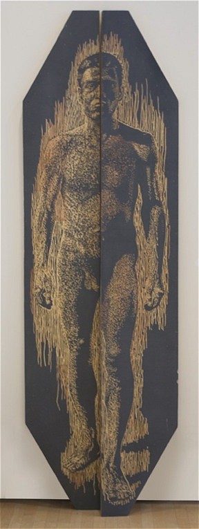
J.A: The Kouros and Kouri pieces. The figure in these prints is a present-day iteration of the archaic Greek Kouros sculpture. I don’t think you can get much more fascinating than this subject in any medium. The figure is visibly sculptural, with a broadly-chiseled solidity. He’s come some distance from the static and stylized Greek model. The way his head leans forward really puts him in motion, and the facial expression makes him very alive. The texture on his skin is part of the monoprint-making technique visible in most of your prints, but in the Kouros it adds a nice historical effect—he looks time-mottled.
H.L: my main idea with the kouros piece was to make my version of the kouros form, with image split in two, to suggest it was striding off the wall. i was going to make a drawing or print on planks, but then decided to do it as a wood cut. i found those two great slabs in a salvage yard and carved them with a dremel rotary cutting tool because i would kill myself if i used chisels.
i was making rubbings to proof it and a friend said i should actually print them. i hired a student to help me during spring break. we printed a range from transparent base (colorless ink) through silver and graphite inks. i like that it feels like the figure is emerging, walking towards. glad you like that piece, or at least that you mentioned it. it’s the newest so of course it’s my favorite this week!
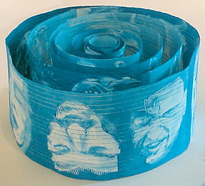
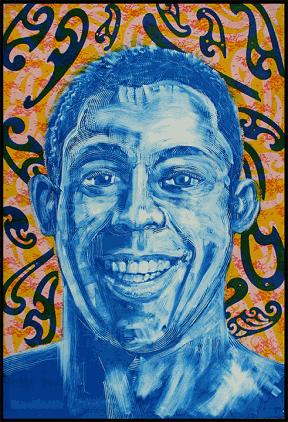
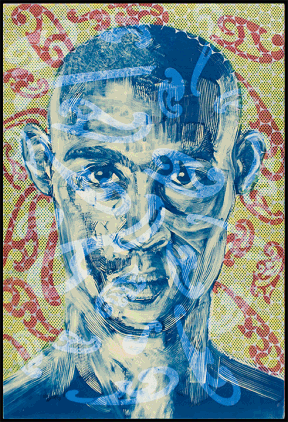
J.A: The Big Smile and Full Face series. These I really love for their dazzling upbeat effect. The faces in these pictures are mesmerizing, as if the emotions of these fellows are rendered on the outside—they’re thinking with their skin. And the backgrounds are quite jazzy, some stunning interplay of color and stamped patterns there. Evidently you’re not holding back here at all but cutting loose creatively.
H.L: thank you. i think that’s just about what i intended. i love the idea of people having auras, of thermal imaging and kirlian photography. so with the scale (big for a print and a face) and the colors (CMYK + metallics) and pattern i was hoping to suggest personality, charisma, magnetism.
J.A: The images in this series seem to be about male companionship of the sensual kind.
H.L: that’s interesting! i never know how people will read my prints, no right or wrong answers. would you say that, as each figure is alone, looking at the viewer, which in this case is male, there is a suggestion of the subject looking back at you in a sensual way? i like the idea that you would find some connection with the individual. or is it an imagined connection between the subject and artist? the portraits are very anonymous to me; i’m most interested in the pose and gesture in selecting images to draw from.
J.A: I would say that, yes there is a suggestion in these pictures of the subject looking back at me in a sensual way.
H.L: i am interested in the idea of the “gaze” which is very different for men and women, and i think it’s different for straight and gay people. for example, if i’m talking to a man and he makes too much, too intense eye contact, i may read it as flirting. i’m also interested in the way that men are portrayed in the media, in mass culture. for example, no american politician would ever dare to be portrayed full-face. what is it about that pose? smiles, and types and degrees of smiles carry shades of meaning too. and pictures of men with their mouths open are SO much rarer than pics of women with their mouths open in general interest magazines. so when you show these simple things, enlarge and call attention to them, they may be unsettling in some way.
J.A: We live in a world filled with double standards I think, and it’s the artist’s job to question that stuff. Now back to your fonts. The inline version of Goya Heavy, this is a retro-lover’s delight. It’s a chunky neon inner spirit, very 1950’s, highway sign, motelish, almost a B-movie vibe.
H.L: glad you like it. if i were to do one more in the series, it would have a zigzag inline. i do love classic motel design, reminds me of riding in the car cross-country with my parents as a kid. neon signs, palm trees, the ‘sanitized for your protection’ ribbon on the toilet seat...
J.A: A zigzag inline for Goya I’ll look forward to. Blackletters have had quite an influence on western lettering ever since Gutenburg’s time, and no doubt some time before that. But since Griffo and Jenson’s time at least there’s been this ongoing internal splintering of the smooth classical ideal—the fracturing influence. Alsace Lorraine is your most successful hybrid from a design standpoint. French script is a natural mate for Fraktur.
H.L: first i had the idea, then i had to find the right parents for my hybridizing experiment. i like the verticality and the pen-drawn character of those. i’d like to see some blackletter get wide use again, apart from a horror, nazi, heavy metal context. to me, that one feels very “storybook”, like a fantastic castle.
J.A: It’s a bit Mad King Ludwig isn’t it? Those fantasy castles in Bavaria, and by extension the now-numerous Sleeping Beauty and Snow White’s castles in Disney amusement parks.
The Ben Shahn and Alan Denney fonts—a solid interest in kitsch?
H.L: the denney fonts are derived from tacky 60s greeting cards, so they’re definitely kitsch. but i don’t think of shahn (at least the originals) as kitsch at all. original intent has a lot to do with the definition of this for me. his inspiration was the lettering of ‘the people’ and his intent, i think, was to capture and ennoble it. although his work does not have the popularity it once had (there’s a funny reference to him in ‘annie hall’ a film we’ve discussed) it’s not kitsch to me.
shahn’s intention was to make this beautiful style widely usable for whatever words one chooses, dangerously populist because the people often say stupid things when given the chance to speak.
i read an article about someone who was collecting beggars’ signs. he gives them each like 20 bucks and takes their signs. my thought was—ooh, there’s a font in that. i have a photo of a garage with a strangely hand-painted sign that i’ve been waiting years to develop, a most curious W, as if the painter didn’t quite understand the letter, or how to paint it.
J.A: Harold we’ve both enjoyed this conversation more than we can describe in words. My only regret is that it has to end now. This is the sad part right here. (cue melodramatic violin music) Thanks so much.
H.L: thank you for taking the time to think about my work and ask questions that have made me think. i’m usually on auto-pilot; but it’s good to stop, look back and think. i think it’s very important for artists to be selfish with their time, not to give too much away, not to think too much about what others are doing. so i really appreciate that you have taken the time out from your own work to talk to me about mine.
 |
 |
 |
 |
 |
 |
 |
 |
 |
 |
 |
 |
 |
 |
 |
 |
 |
 |